
The first step in creating an ad on TikTok Ads Manager—choosing an advertising objective—was outdated and confusing. Partnering with Product Design, UXR, and Visual Design, I led the content design for a redesigned experience that simplified decision-making and improved clarity. The updated flow is live in the product today.
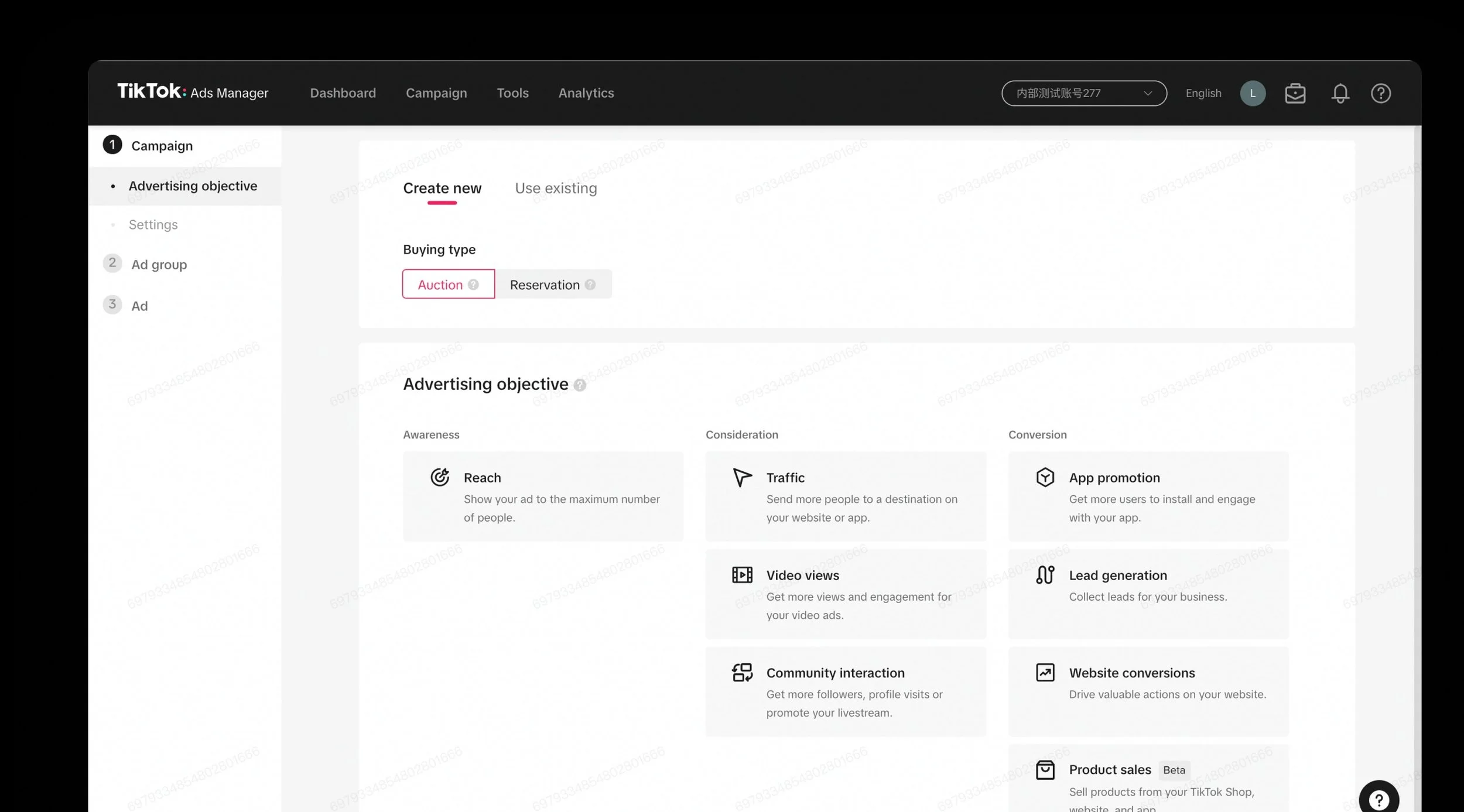
The old UI
Not easily scannable, there’s information even below the fold
Cannot select objectives or campaign types all in one view
Doesn’t allow platform scalability in long term
Workshops
The team got to work with the user feedback from our own platform, competitor analysis we conducted, as well as results from UXR study.

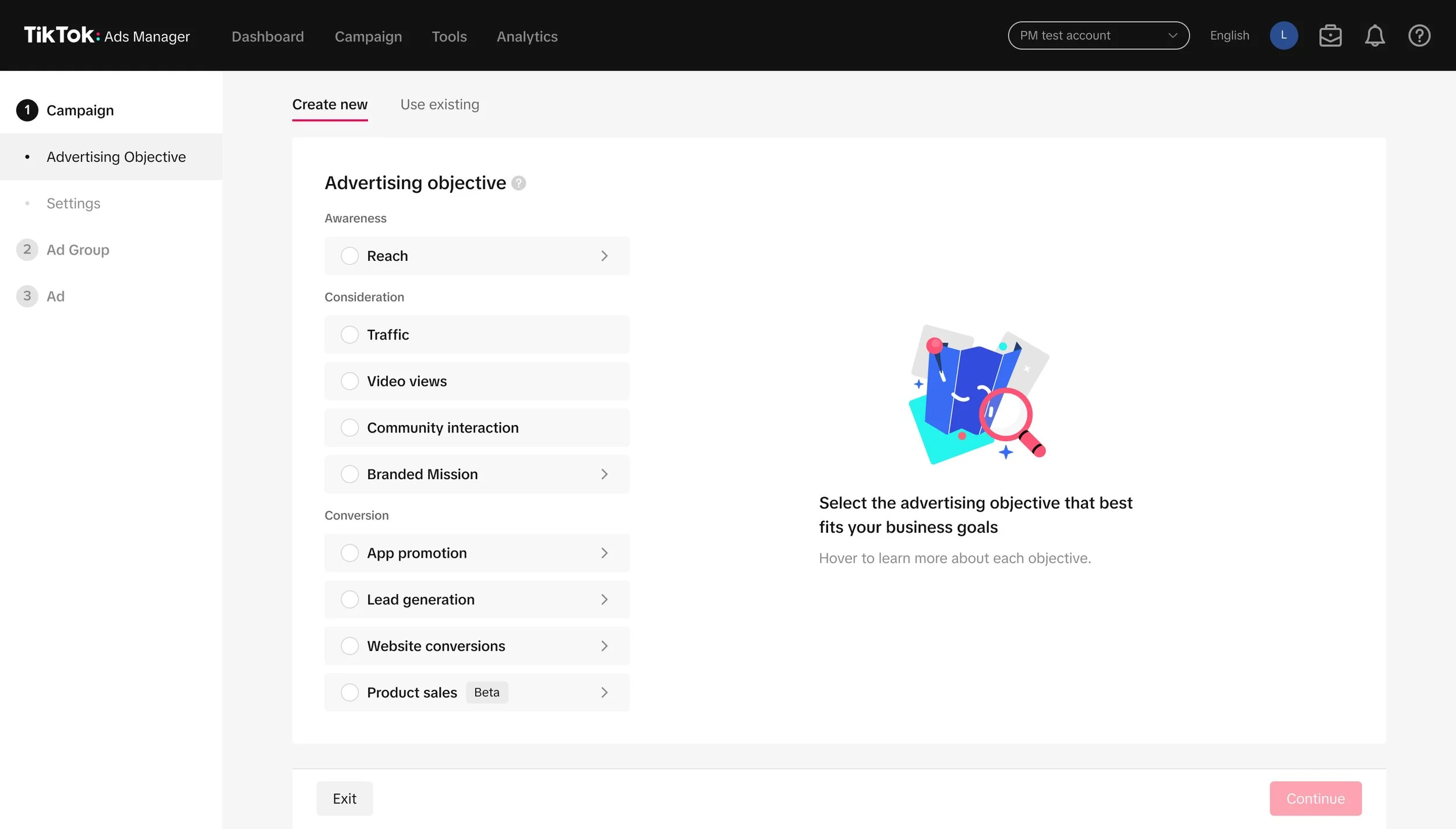
New UI with entirely redesigned information structure
Starting with the added empty space state. Solving part of the previous lack of guidance issue.
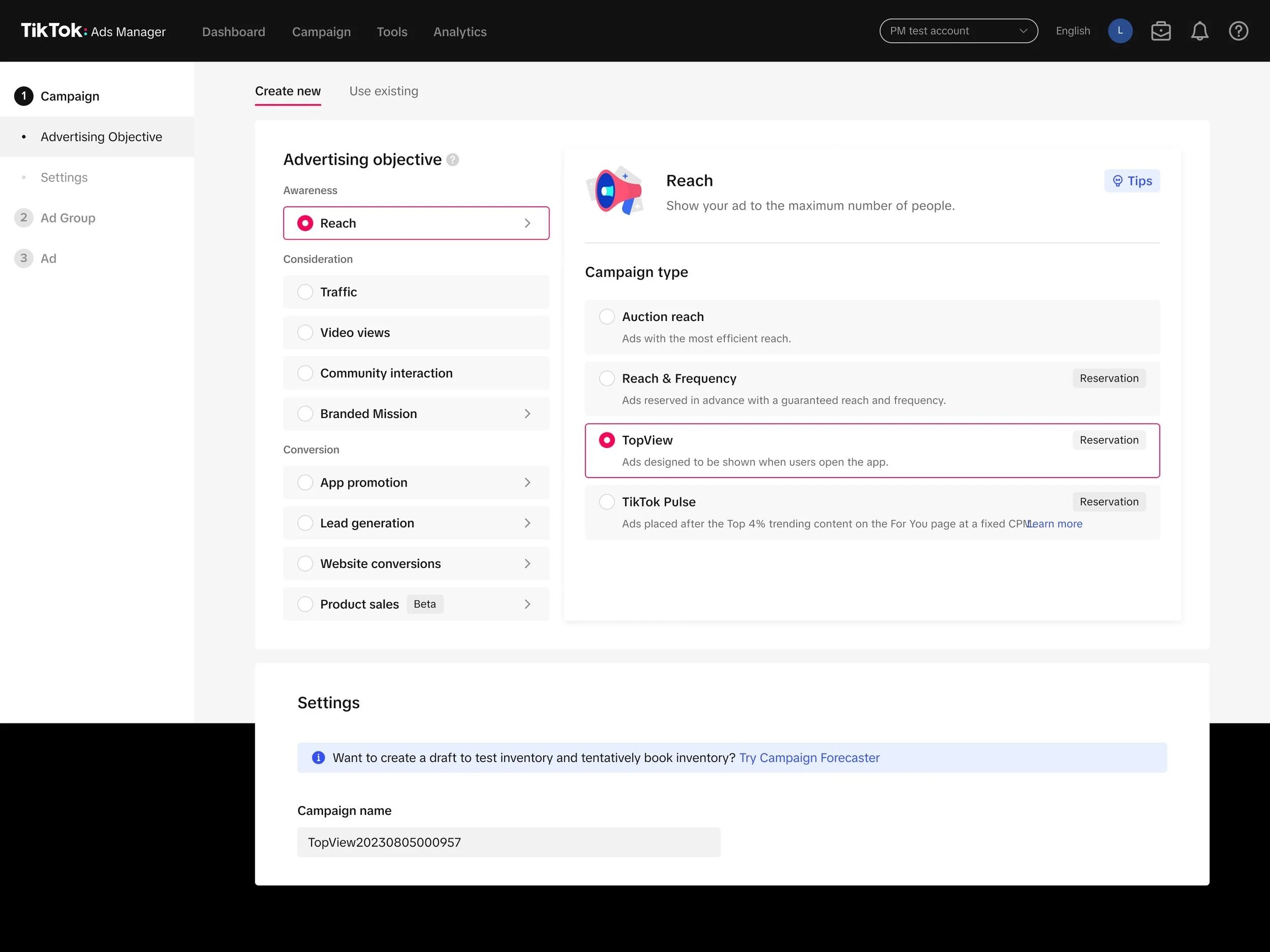
For objectives without multiple campaign types, the empty space will be used to communicate benefit callouts of choosing this objective.
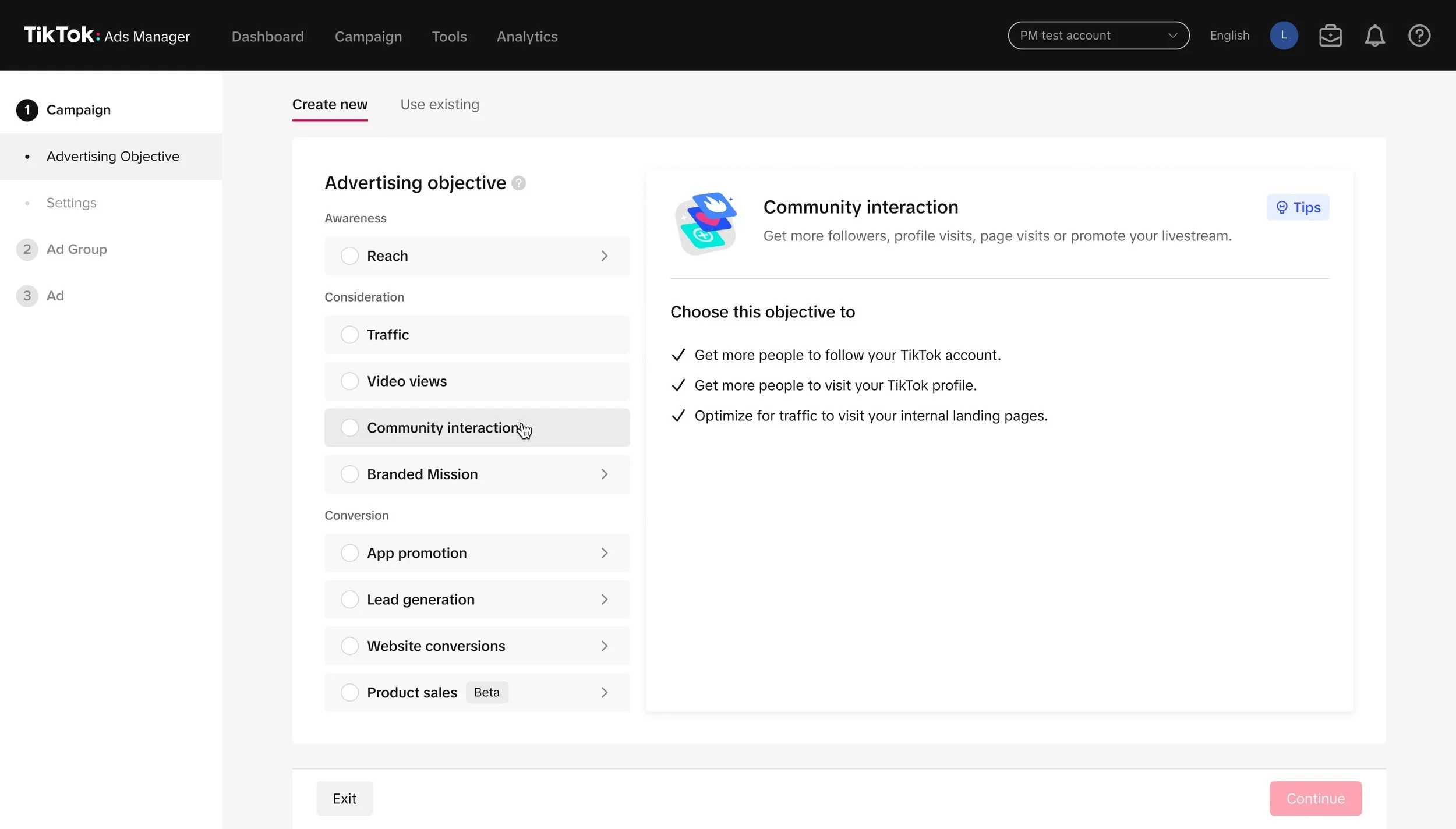
The objectives are now stacked top down from upper to lower funnel, and upon hover on each objective, the user will be able to each campaign type available and its descriptions.

But for those with multiple campaign types, those extra benefit callouts will be tucked in the “Tips” hover tip.